


An Announcement from Melany Duval, Senior Vice President and Chief Philanthropy Officer at The Jimmy Fund:
I am delighted to announce our new Dana-Farber Cancer Institute and Jimmy Fund logos.
After more than two decades, Dana-Farber began an exploration into updating our visual identity. For Dana-Farber’s logo, the goal was to create a vibrant and modern visual identity to match the prominent, world-class reputation of the Institute. The exploration of the Jimmy Fund logo included bringing “connective tissue” and a visual unity to both brands. Working with similar colors, shapes, sizes, and typography, the two logos are purposefully designed to clearly connect to one another.
Dana-Farber and the Jimmy Fund now have a seamless visual identity for the shared and unrelenting goal of finding cures for all cancers, highlighting Dana-Farber’s deep commitment to science and clinical care that characterizes and distinguishes the Institute, and guides all that we do.
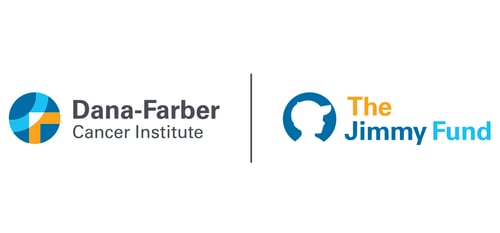
The new Dana-Farber logo contains a “lens” icon which is a stylized D and F, as if one is looking through a microscope. This represents the interplay of research and care.
The new Jimmy Fund logo celebrates our past while offering a warm welcome to the next generation of supporters. Like the Dana-Farber logo, the Jimmy Fund also utilizes a “lens” icon. The Jimmy Fund lens is a silhouette of a boy who represents the original “Jimmy, Einar Gustafson – then a 12-year-old patient of Dana-Farber Founder Dr. Sidney Farber – who was dubbed Jimmy to protect his privacy.
The baseball cap is a nod to the Jimmy Fund’s origin on the Truth or Consequences radio program in 1948, asking the public to provide Jimmy and his fellow patients in the cancer ward with a television to watch the Boston Braves. This evolved into a longstanding partnership with the Boston Red Sox that began in 1953, the oldest and most successful charity relationship in all professional sports.
Our new logo for the Jimmy Fund was purposefully designed to be hopeful and have universal appeal to all people facing cancer, at any age—young and young at heart.
The Dana-Farber and Jimmy Fund logo changes will be introduced to the community immediately and fully integrated over the next couple of years.
For more information about our new logos, read our official press release.


Melany N. Duval
Senior Vice President and Chief Philanthropy Officer
This blog post was originally published on The Jimmy Fund blog.